Hello my friend, it’s nice to see you again.


Nice to see you V. What are we talking about today?


It’s time for another coffee break. I’ve had some ideas rolling around in my head for some time now, and I’d like to discuss them with you.


Wonderful. So, what’s the topic today?


I want to talk about the hierarchy of ambigrams.


What’s that?


Well, it’s better to start with an example we already know. And then you’ll see how the same principle applies to ambigrams as well. Shall we?


Of course!


Have you seen this diagram in mathematics? It’s the hierarchy of numbers.


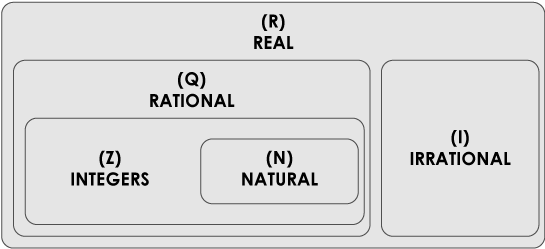
I remember this from my school days, but that was quite a while ago…


Don’t worry. We won’t do math here. But mathematicians did a very good job structuring the hierarchy of numbers.

Side note: And a pretty bad job naming them, but that’s another story.

So, the important thing in this diagram is this: First, the most basic numbers are what we call natural numbers. These are 1, 2, 3, 4, 5 and so on. It makes perfect sense that we call them natural. These are the numbers we use in everyday life when we count apples in our bag. These are the fundamental numbers. And understanding those, we can explore other types of numbers.

Then there is zero (0) and negative numbers, such as -1, -2, -3 etc. All of these numbers together are called integers. Integers is a bigger group of numbers that include natural numbers. In a way, integers are based on natural numbers, since the discovery of natural numbers had to occur before the idea of integers could even exist.

The process of discovery goes on and on. Something new is invented based on the more fundamental categories before it. When you put fractions into play, you get a/b, which is a rational number. Then we have irrational, then real and so on.

If that was clear, my fellow reader, then my idea will be easy to grasp. Was it clear?


I believe so.


Wonderful. What would you say if I told you that a similar hierarchy exists in the world of ambigrams?


Do you mean that some ambigram categories are more fundamental than others?


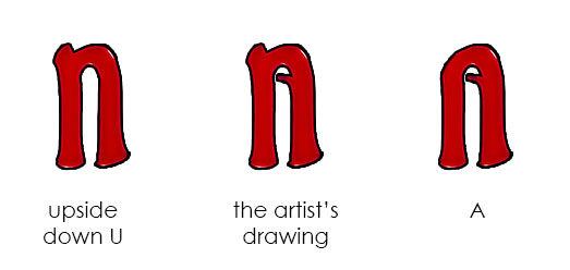
Exactly! And we currently have two of them, geometric and mind. One for those two is the foundation of all ambigrams. Which one do you think it is?


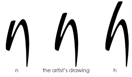
Hm… I would probably say… geometric? Since the first ambigrams were rotational ones?


You’re right that artists first tackled rotational ambigrams. But, I will rephrase the question, because I want you to understand it more clearly. In ancient times, do you know what people believed the classical elements were?


Earth, water, fire and air?


Correct! It was centuries later on that people discovered that matter consists of molecules. And then, they found out that a water molecule consists of two hydrogen atoms and one oxygen atom (H₂O). Those atoms were, and still are, the fundamental building blocks of matter, the chemical elements.


So, what’s more fundamental? An atom or a molecule? Hydrogen or water?


Hydrogen.


That’s right. In a similar way, artists first tackled geometric ambigrams (molecules) and then discovered the fundamental ones, mind ambigrams (atoms).


So, you’re saying that mind ambigrams is the fundamental category of ambigrams?


Yes.


Why?


I’ll tell you. But first, here’s the ambigram hierarchy diagram, in a similar way to the hierarchy of numbers.


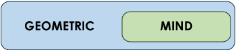
The mind category is the fundamental category of ambigrams, since they contain the elements that make ambigrams work. That is, the most basic, primary and substantial tools of duality.


Geometric ambigrams build upon those tools, introducing something new. As negative numbers are based on the natural ones, resulting in -1, -2 and so on… in a similar way, geometric ambigrams are based on mind ambigrams, introducing geometric transformation, such as rotation and reflection, leading to every geometric ambigram that we know.


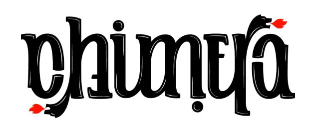
It’s better to explain with examples. Let’s revisit…

   Middle-form ambigrams 


Just to remind you what middle-forms are, here’s ‘teach-learn’ piece by John Langdon.


And here’s how h/n works.


Now, let’s move over to geometric ambigrams. Here’s a rotational ambigram. It’s “chimera” by Nikita Prokhorov.


Let’s take a look at the c/a glyph.


Now, c/a is letter pair similar to (-1)/1 number pair. That is, we have a basic natural number, which is 1, we add the minus, so we get the number pair (-1)/1. In our case, we have a design choice (we’ll find out what it is), we add rotation and we get the letter pair c/a.

In order to find what this design choice is, let’s remove rotation for a moment to see what we have. In a sense, let’s remove ‘minus’ from -1 to see what we get, which should be 1.

Here’s the letter again by itself in one orienation.


That’s an ‘a’… that looks like a ‘c’ when rotated.

In order to understand what’s happening here, we must see how a normal ‘ca’ pair would look like.


But ‘chimera’ is a rotational ambigram. So, we need to see how ‘ca’ would look like with an upside down ‘c’.


In order to get the initial glyph Nikita used, he made a design choice. This choice was to use the middle form of these two, resulting in the following glyph.


The artist in this particular example achieved duality in his design using a middle-form, then added a rotation.

So, this glyph…


is a middle-form ambigram of a normal ‘a’ and a rotated ‘c’.

But since rotation is introduced, we count it as a rotational ambigram.

It’s exactly the same thing as -1 and 1. If you remove ‘minus’ from -1, which belongs to ‘integer’ category, you end up with 1, the most fundamental number, which belongs to the ‘natural’ category.

The same happens with this glyph. If you remove rotation from it, you end up with a middle-form glyph, the most fundamental type, which belongs to the ‘mind’ category.


Here’s another example. It’s ‘Brazil’ from Paula Thais.


The r/i glyph is a middle-form ambigram of a normal ‘i’ and a rotated ‘r’.


And a last one, that’s “square” from Bryan Sanders.


And here’s the middle-form of normal ‘a’ and rotated ‘u’.


Vassilis, isn’t this how all ambigrams work? In the case of rotational ambigrams, don’t we take the middle-form of the letters to create the ambigram?


Yes and no. You use middle-form often, that’s correct. But are you aware that you use almost all mind types, if not all, when creating a rotational ambigram? Middle-form is one tool you can use to create duality.


In fact, when you’re designing a rotational ambigram, you use fill-the-gap, hidden-cue, stableshift, arrangement and all sort of mind types, without even knowing it. And this applies to all geometric ambigrams, not just rotational.


Really?


Absolutely! Take a look at this…

   Stableshift 


Just to remind you what stableshifts are. Here’s ‘win-wiz-‘ piece by me. The duality comes from imagining what’s the correct orientation of that letter n/z.


Now, moving over to geometric ambigrams again. Do you remember that piece? It’s “what goes up must come down” by Murilo Silva Tanajura, aka Mugga.


That’s a reflective ambigram. More specifically, it’s a lake ambigram (horizontal axis of symmetry). Take a look at h/u. What a wonderful stableshift there!


The artist didn’t go for a middle-form h/u, as it would spoil the design. He went all for a stableshift, with a flipped ‘u’ in ‘must’, that works perfectly.


Want another one? Look at Mugga’s piece again. The e/m glyph is also a stableshift there. Don’t understand why? Here’s a similar explanation to a rotational piece. It’s ‘wave’ by me.


Where’s the stableshift here?


It’s the w/e. Having written that horizontally, you would read WAVM. Having rotated W 90 degrees, you would read 3AVE or BAVE. So, a stableshift, a semi-rotated letter having you not knowing which side is up, saves the day.


In fact, here’s a quick sketch explaining that. Having a steady image, there are some orientations that offer themselves to double read.


In order to achieve a w/e in the rotational ‘wave’ piece, I had to find two diametrically opposites that would read ‘w’ and ‘e’. The top-left and bottom-right one was the best choice.

   Hidden-cue 


Are there hidden-cue glyphs in geometric ambigrams as well?


Of course! But let’s remember once again what a hidden-cue ambigram is. Here’s one.


I remember that. ‘Out of order’ and ‘out of border’.!


Correct. What happens here is that we have a small clue that results in two reads, depending if you read it as a letter or not.


Now, back to geometric ambigrams. Here’s “Can you hear me?” piece by Bryan Sanders. Can you spot the hidden-cue here?


Hmmm… where is it exactly?


It’s ‘r’. In ‘you’, you think that this small curve is just a flourish. You consider it a decorative element. Whereas in ‘hear’, you clearly read it as a letter.


Here’s another piece. It’s called ‘treason’ by Jeff Harrison.


Where’s the hidden-cue here V?


This one is trickier. It’s the pointing horizontal line of ‘T’. Had that line followed the rest of the letterforms, it would result in ‘treasoil’ or something similar, with an ‘L’ in the end. But, the artist cleverly draws it in a way that you read it as a part of the letter on the left side, but not on the right.


I think you’re understanding now how geometric ambigrams use many types of mind ambigrams in their creation. And that’s what makes mind ambigrams, hierarchically speaking, the fundamental category.


Without further ado, let’s visit a couple of other mind ambigrams hidden inside geometric ones as well…

   Fill-the-gap 


Remember fill-the-gap ambigrams? Here’s one by me.


I remember that one as well.


In this one, you can’t see the full shapes of the letter and you guess the missing part. The duality comes from the way you fill those parts, resulting in a fill-the-gap ambigram.


In a similar way, this is what happens in many geometric ambigrams as well. Here’s ‘butterfinger’ piece by Bryan Sanders.


Can you spot the fill-the-gap glyph?


Let me think… I suppose, it’s the U/G glyph?


Perfect! On the left side, it’s just a ‘U’. On the right side, your mind adds the missing bottom part of the glyph and you read ‘G’.


Now, here’s another one. It’s the perfect example of fill-the-gap glyphs inside a rotational piece. It’s ‘Syzygy’ by John Langdon.


Wow!


All glyphs are fill-the-gap mind ambigrams. All require ‘Y’ to stay as they are, but require S, Z and G to mentally fill the gap below the baseline in order to be read. Amazing!


Now let’s visit a controversial mind ambigram type…

   Arrangement 


So, you say that there are arrangement ambigrams inside geometric ambigrams?


In some pieces, yes. The point is to understand that duality cannot emerge just from middle-forms, but from all sort of other design manipulations. One of those manipulations is the principle of arrangement ambigrams.


Show me!


Once again, let’s remember what an arrangement ambigram is. Here’s ‘silent-listen’ by me.


It’s the specific arrangement of letters in order to guide the viewer read them the way you want to.


But, in a normal geometric ambigram, don’t we always read from left to right? And when the piece is rotated, don’t we read the other way around?


Not in this piece.


That’s ‘Chaos and Order’ by John Langdon, by the way. If you didn’t catch it, here is the reading direction. In ‘Chaos’, you read first O, then S. In a normal mirror ambigram you shall read flipped S first and flipped O next. But in this piece, in ‘Order’, you read O first (again!) and then R (mirrored S). The order has changed!


I get it.


Here’s a rotational piece, made by the same artist. It’s called ‘Rube Goldberg’.


Let’s focus on the central part, GOLD. Had the artist laid down the letters as we read them normally, he would write G first, O second, L third, D last. But this would lead us to read GLOD when rotated. That O was the problem. The artist had to make a design choice to solve that. And the solution was to keep the normal GLD in place, which reads the same upside down as it is, and place the O right on top of the other letters. This way, no matter how you rotate the piece, you always mentally place O between G and L.


That’s a clever thing to do!


That’s exactly the principle of arrangement ambigrams, my friend. Carefully placing letters in order to achieve the read that you want to.


Which leads me back to the start of this discussion…

  The hierarchy of ambigrams 


The point of today’s coffee break was exactly this. To understand the relationship between geometric and mind ambigrams. Those two categories have a hierarchy. The mind category is the fundamental one. The geometric category builds upon the tools used in the mind category.


Just like numbers. Natural numbers are the fundamental ones. Integers, which include negatives, come next. But they are not called negative naturals, they have their own name, integers.


Similarly, even if geometric ambigrams are mostly based on mind ones, they are not called rotated mind ambigrams, they have their own name, geometric.


But what’s the reason you wanted to talk about this? What’s the point of having a hierarchy of types?


That’s an important question. Soon enough we’ll be introduced to a third category. You’ll see ambigrams that are neither mind or geometric. And having this hierarchy from before, it will be helpful to understand what’s going on. So, in a sense, this is a prelude to a third horizon. And I’m fascinated by it!


Oh! Me too! I remember you talking about more colours in the map, is that it?


Yes. Until now we’ve navigated the green horizon and the blue one. A new coloured horizon is coming. And it’s wonderful!


Oooo…


But hey my friend! That doesn’t mean that we’ve investigated all the green and blue territories yet! There are a lot more here as well, but I believe this is a right moment to see something new. To understand how we, artists, can create duality in a typographic piece using other dimensions.


And no, I don’t mean the third dimension. Even if 3d typographic pieces exist, this new horizon does not have to do with the third spatial dimension. A rotational 3d typographic piece is still a geometric ambigram. This is on a new level of using design in our favour in order to achieve duality.


Now I’m really curious…


And you know what? I’ve been waiting for it for a long time now. And I will confess something to you…


(V takes a sip of coffee)


If you remember, I said that there are a lot of categories as well. Many horizons. A lot of colours! But it all needs buildup. I cannot talk to you about new realities without first establishing the basic ones. Just as a teacher cannot talk with third-grade kids about π, e, or even 3π+i. The situation requires patience and time.


We are those kids, my friend. Ambigrams have barely been explored, and we are all up and coming Einsteins in this fascinating field! I’ve been leading you on this journey, and I’m excited to help us all grow in our mastery of ambigrams, it will just require patience and time, if we have that to spare. Do you?


Oh, of course my friend!


Good, I do as well. Whoever wants to learn, welcome aboard. Now we’re moving up a grade…

Do you want to know when a new class is online? If so, subscribe to the newsletter right below. The seats are endless.


Also, if you have an idea of what the new upcoming horizons is about, you can always write your ideas to [email protected].