Hey my friend, I made a mistake.


What mistake are you talking about, V?


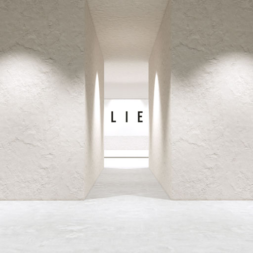
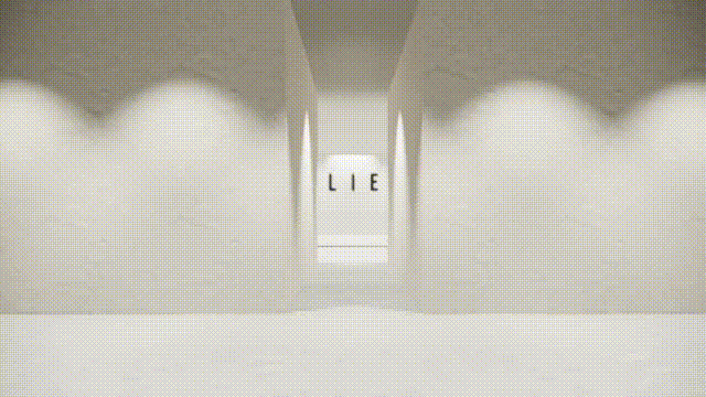
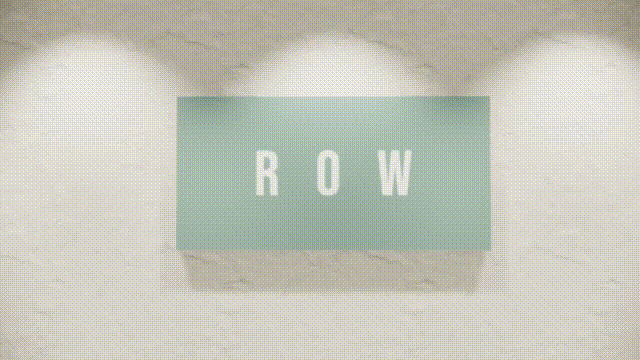
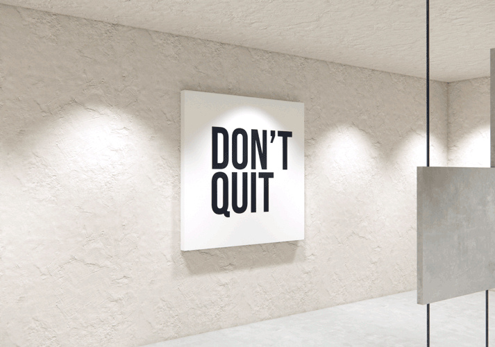
In the previous chapter, we’ve got a look at subtractive filter ambigrams, like this one.


The mistake about this is the naming. Currently, our filter map looks like this.


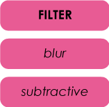
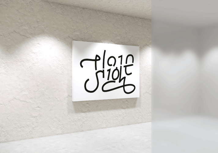
But upon writing this chapter, I realized that there is no cohesion about how I named this type. A more correct way to name this type of ambigram would be solid filter ambigram.


The reason is that in the blur filter ambigram, the name was given describing the filter itself. It’s a blurry filter. Yes, it can blur things, but in Otto’s piece, it also morphed and fused the letters together. If I had named this filter as morphing or fusing filter, it would have also been a mistake, since I would describe the action of the filter and not the filter itself.


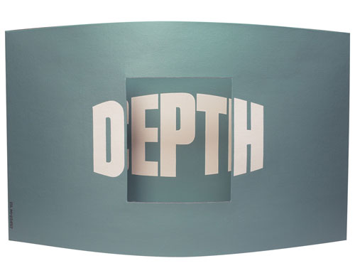
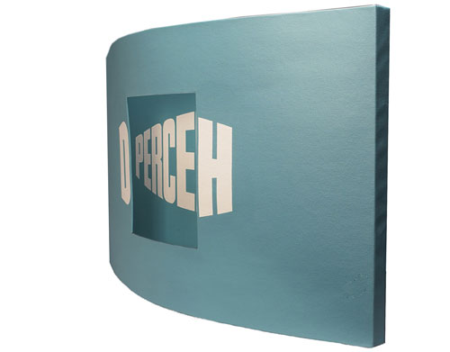
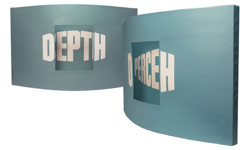
Now, going back to the subtractive filter, I described the action and not the filter itself. The filter is a solid piece. It’s something that hides things. Also, it’s something that can remove things from the image behind. Similarly, I could name this type of ambigram as hiding, removing or… subtractive filter, which I did. But I strongly believe that I shall rename it to describe the filter itself, which is solid. Therefore, this type of ambigram will now be called a solid filter ambigram.


This study amazes me for many reasons. One of those is that I explore typography pieces of artists around the globe, including yours, – yes yours! – and from time to time I find things that don’t work as expected. Therefore, I have to change my way of viewing them, which forces me to study them from a different perspective or analyze them using new techniques. That’s why I started this entire exploration by saying:


As an ambigram designer, you may think you know ambigrams.
So did I, until I started this journey.


Sometimes, this means renaming things.


Remember when there were reasons that the term perceptual shift is wrong, since it’s vague and it actually is an umbrella term for many mind ambigrams?


The purpose of Ambigram Horizons is to deliver a thorough table of all ambigram types. Who knows? Maybe in the future we’ll see that a 2d table is not efficient to show all types. Maybe it’s 3d. Maybe something else.


The point is that Ambigram Horizons is alive. And that’s cool. Back to the solid ambigrams.

You’re back at the ambigram museum hall.


You passed through geometric and mind ambigrams and you are walking through this weird space of filter ambigrams. You’re still trying to understand. But you also have a feeling that you’ve finally got it. You have a pretty good idea of what a filter ambigram can be, after all.


But not, my friend.


Not yet.


The path guides you through a corridor to the next hall. The next piece is already visible.


You are wondering why there is a ‘lie’ displayed there. You walk through the corridor and voila!


You now read ‘believe’.


Wait a moment Vassilis. What was that? Why is this piece here? What’s the point of it?


You see, my friend, no matter how strange it may seem to you, this is a filter ambigram. Specifically, a solid one.


But… what’s the filter?


The corridor.


As in the previous filter ambigrams, the artist has placed ‘believe’ in a specific spot, in which you can read ‘lie’ only if you are behind the filter, which, in this case, are the walls.


So, can we say that the corridor is part of the filter ambigram?


Exactly! In this piece…


…the glass is part of the filter ambigram. Actually, the glass is the filter. Similarly, in this piece…


…the walls are the filter.


That’s fascinating!


Indeed! But as you walk through the ambigram museum, unexpected things happen. Until now, you’ve seen some solid filters that hide parts of the image behind. Do you remember that I told you there are solid filters that can do more than just removing parts of the piece?


Oh, yes!


So, let’s move on the next piece in the hall to see some crazy stuff. Follow me.

Your next task is to figure out why this piece is a filter ambigram. What do you think?


Hm… I don’t know. In the previous cases there was a filter right in front of the piece. Now… where is it?


Take a look at the brochure you got when you entered the museum. This is a manual for every piece displayed here. Where does the artist want to lead you?


Hm… Give me a second… page 5… ‘LIE – walk through the cor…’ no…. that’s it! I found it! ‘ROW – stand right in front of the piece and then take 8 steps back.’


Ok, let’s do it.


Grow? What’s this? Did we just add a letter?


Exactly!


But, I can’t get it. I mean… is this supposed to be a filter ambigram?


Yes. A solid ambigram. The point is that in this case, the filter adds a letter, while previous examples subtract a letter.


So, are filters supposed to be able to add letters as well?


Of course! They may also do both. Here’s a piece of John Langdon. It’s called ‘depth perception’.


I’ve seen this work. John is incredible in creating such pieces.


As of now, January 2026, I hope he’s creating miracles up in the sky. He’s no longer with us. But he’s one of the reasons I started this type of art and I’m glad he existed. May God rest his soul in peace.


John, this chapter is a tribute to you, my friend.


Back to solid ambigrams, is everything clear?


Well… yes, but no. I mean, it feels strange that you can add letters to a typographic piece by using another layer of text and call it an ambigram.


It feels strange at first, I agree. But that’s the point of the whole ambigram category. You put something in between you and the art, and you get a second reading.


Why do you think John did not name this piece as ‘DH PERCEPTION’? Since, this is actually what he wrote, no?


Well, yes, but no. He used D in order to hide PERC and H to hide TION. So he end up with DEPTH, when you’re looking from the front.


You’re absolutely right. Let’s take a look at it again.


When you walk around the piece, you can read PERCEPTION in the back plate, and while standing in front, where John wants you to stand, you read DEPTH.


Now I shall ask you. If he’d written the word DEPTH in a unique plate and it was placed a certain distance in front of PERCEPTION, do you think that this would be an ambigram?


You mean that there are two posters, each one displaying another word? No, that’s just two posters.


Correct! And the reason is that in the previous case, the central letters EPT are used twice. It’s the reason the artist used 12 letters ‘DHPERCEPTION’ but you read 15 letters ‘DEPTH PERCEPTION’. It’s the same principle as in all ambigrams, even in rotational ones. You read a 5 letter word, let’s say, you rotate the piece, and you end up reading another 5 or 6 letter word. In both cases, displaying some letters, the viewer reads more.


And you, my friend, you learnt something new today. And I’m happy about it.

I’m happy too, V. Now I’m inspired, I want to create something like this.


I can’t wait to see it!


Remember! The filter can be anything between you and the art piece. Actually, the filter is part of the art. Moreover, it can be anywhere. Far enough like ‘row-grow’? Good. Closer like ‘hide – plain sight’? Even better. Too close like ‘Depth Perception’? Amazing. You can do whatever you want.


And don’t forget. For solid ambigrams, you must have at least some common area between first and second reading. The more ‘dual read’ there is, the better.


Now go create something, you, amazing artist! You got it!

Send me your solid piece at [email protected]


And if you have any idea of a creative type of filter ambigrams, hit me as well! I’m all ears.