 Perceptual shift
The idea is simple. Letters have forms. When a form resembles two letters at once, you get a perceptual shift. The best way to understand this principle is by looking at an example. Here’s a piece by John Langdon, it’s called ‘teach-learn’.

One person could read this piece as ‘teach’. Someone else could read this as ‘learn’. Some people can read both.
I will partly quote Mr. Douglas Hofstadter here, when he gives his definition of the ambigram. “…one can voluntarily jump back and forth between the rival readings… by simply alternating one’s perceptual bias towards a design (clicking an internal mental switch, so to speak)“. For those who don’t know, Mr. Hofstadter is a cognitive and computer scientist, he’s the father of ambigrams and coined the term ‘ambigram’ back in 1983.
Now let’s get back to John Langdon’s piece. What do you think happens in the viewer’s mind?
I see that some letters look like two letters at once.
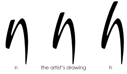
That’s right! Let’s take a closer look at how the artist deals with the n-h letter combination.

On the left, you can clearly see an ‘n’. On the right, you can clearly read ‘h’. But, in the middle is what John drew. The letter ‘h’ has an ascender, while ‘n’ does not. The middle image is intentionally drawn in a way that you cannot possibly know if it’s an ‘h’ with a short ascender or an ‘n’. Also, the brush style can totally justify an ‘n’, since there is not a clear x-height to a brush letterwork.
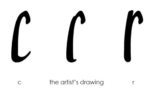
The same happens in the r-c letter combination, which is more difficult to pull off. Let’s take a closer look at it.

On the left, this is what a ‘c’ would look like. On the right is what an ‘r’ would look like. The ‘r’ has a stem and the ‘c’ has a finial. In other words, the upper part of ‘r’ is separated in two parts and the lower part of ‘c’ curves. John has meticulously drawn the letter with a slight bump on the upper part and a slight curve on the lower part. It’s both ‘c’ and ‘r’ and none of them at the same time.
The same happens with l-t letter combination. The letters ‘e’ and ‘a’ stay the same in both interpretations.
So, a perceptual shift uses something like ‘the middle image’ of two letters?
The middle form I would say.
An important side note here: In fact, if it didn’t have a name, I find the term ‘middle-form ambigram’ to be more suitable for this type. I believe that the term ‘perceptual shift’ is vague, since it literally means ‘a shift in the perception’. All mind ambigrams require a shift in our perception. The second term for this type, ‘oscillation ambigram’ is not suitable either. Oscillation means the viewer is jumping back and forth between two different readings. Which is right, but not 100% right so as to define a type of ambigram. A figure-ground ambigram, which we will study in a while, is both ‘a shift in the perception’ and the viewer can ‘jump back and forth into two readings’. That’s why I believe the term ‘middle-form ambigram’ is the most suitable for this case. But, no matter if you call it ‘perceptual shift’ or ‘oscillation’, these ambigrams are amazing and I’m glad some people can pull these off. Well done people!
Indeed, there is something special about perceptual shifts. Can you share some other designs?
Of course, here are some other pieces by some amazing people.
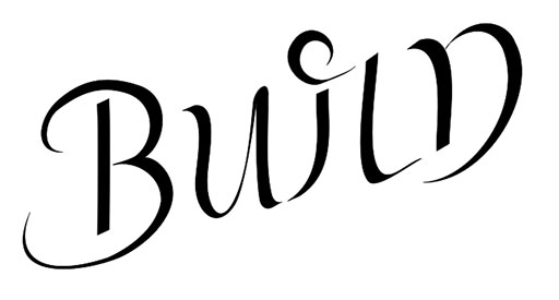
This is ‘build-burn’ by Otto Kronstedt.

And this is ‘magic-music’ by Jose Aquino.

 Welcome!


