 Figure-ground ambigrams
Hello my friend, do you know what a figure-ground ambigram is?
Hello Vassilis! I think I do, but can you show me an example first?
Of course! Here’s a piece by Punya Mishra, it’s called “good-evil”. What do you read first?
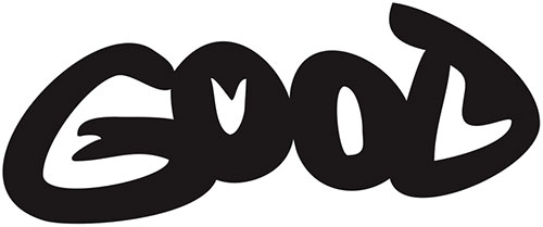
Well, I read “GOOD”. Where is ev…? Oh! I saw that! “EVIL” is inside “GOOD”. That’s so creative!
Remember talking about perceptual shifts and how they take advantage of the middle forms of the letters?
Yes, I do.
Now, this is even crazier. The artist plays not just with the forms of the letters, but also with the negative space.
What’s negative space?
It’s the space around and between the subject of an image. In typography, it’s the space around, in between or inside the letters.
Also, it’s called ground. In this example, you can think of the black letters as the foreground and the white space as the background. Now name those two as ‘figure’ and ‘ground’.
Give me more details. Why did I read “GOOD” first?
Well, we usually read black letters on white paper. So it’s habit to look for a word in black on a white background. But in this piece, there are some details that show something else is going on. Let’s see the ambigram again.

You may have asked yourself, why are the two Os different? Why is the spur of G like this? Why is there a liquid drop on the bowl of the D?
Well, it’s because the artist intentionally manipulated the negative space, in order to create the second word, “EVIL”. For those who still can’t read it, here it is.

That’s a nice way of creating ambigrams. Can you show me some more?
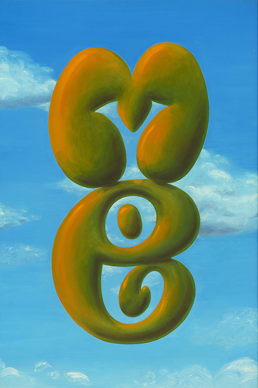
Of course. Here is a piece, called “us” by John Langdon.
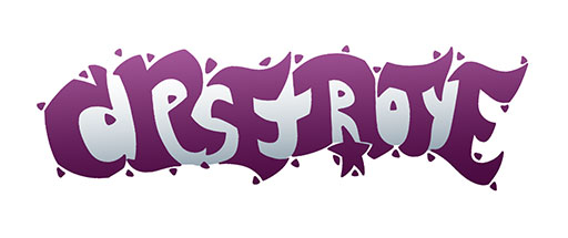
Here’s a piece, called “create-destroy”, by Chump.
And another one from the same artist, it’s called “body-soul”.
