Hello my friend, I have some good news.
Hello Vassilis, what news?
We’ve found a new way of reading things. Which means, we’ve found a new type of ambigram.
What do you mean by a new way of reading things? Can you explain?
Remember in the previous chapter we discussed how we take several things for granted and how we take advantage of this in order to create new types of ambigrams?
Yes, I remember that figure-ground ambigrams exploit an unknown way of reading, that is reading black on white, but at the same time we can read white on black, using the negative space.
That’s correct. Now, can you imagine what other standard we have set and are not able to deviate from?
Hm… No, can you give me a hint, please?
Yes, it’s about the direction we read. You see, we normally read from left to right, and from top to bottom. Of course, there are some languages where it’s the opposite, such as Arabic, Hebrew etc, but the point is that there is a standard way of reading in each language.
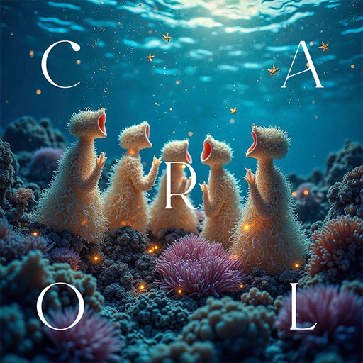
Now, look at this typographic poster, by Mark Gowing.
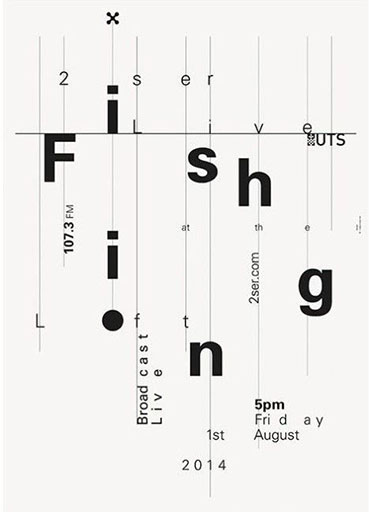
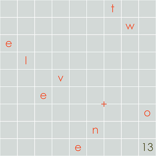
For some reason, we read Fishing. And that’s what the artist intended for us to read. But, even though it’s a single word, its letters are spread apart. Yet, our mind reads the word easily.
Right, I see this, but what does this have to do with ambigrams?
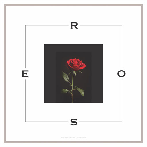
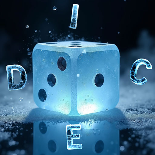
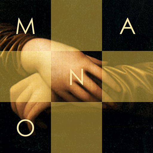
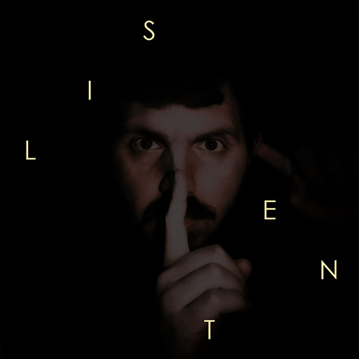
Let me show you some more examples like this and I’ll get to it. Here is “il vento” (the air) by Monica Fratesi, “Dark” by Sam Steiner and “Anesthetize” by Berkay Taş.
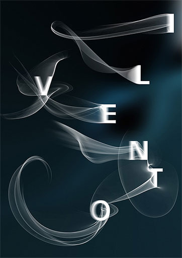
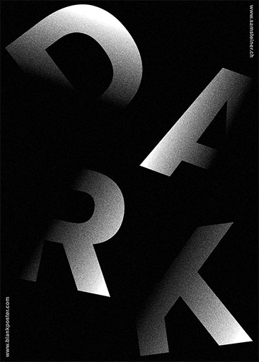

All of the posters above have a unique goal. To guide you read the letters in the correct order.
I see. These are great pieces, but I wonder how they relate to ambigrams.
Now, before we dive in, let me reiterate. We can read typographic pieces even if the letters are not in order. That’s the standard we are going to completely exploit and create amazing pieces!
And that’s how we can create…