There are two definitions of an ambigram, which are the two sides of the same coin.
An ambigram is a typographic piece of art that has at least two ways of being read.
An ambigram is a typographic piece of art that remains readable after a transformation happens.
The core function of an ambigram is this:
• I read something
• Something happens
• I can read it again
The “something happens” part is a transformation and it constitutes the typology of the ambigram. There are three categories of ambigrams: geometric, mind and filter.
• If “something happens” to the art, we have a geometric ambigram.
• If “something happens” to the viewer’s mind, we have a mind ambigram.
• If “something happens” in between, we have a filter ambigram.

The hierarchy of the categories is illustrated in this diagram.
As of today, we’ve not talked about hierarchy of filter ambigrams.

Definitions
 Geometric ambigrams
Rotational ambigram: A typographic design that rotates to its center.
Sub-types: 180°, 120°,90°etc.
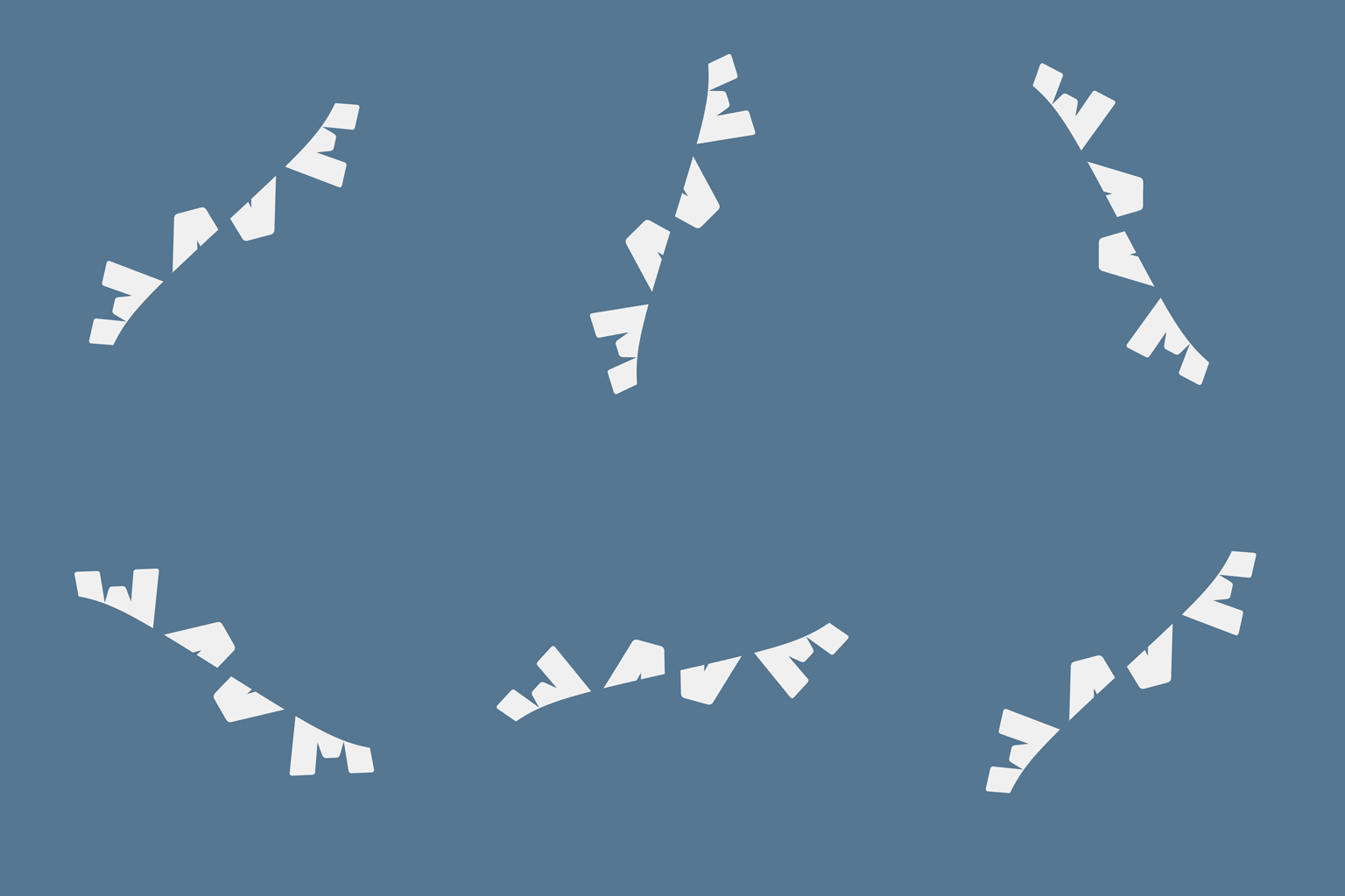
Reflective ambigram: A typographic design that reflects to its center.
Sub-types: mirror (vertical axis), lake (horizontal axis), diamond (diagonal axis).

Slidegram (or translation ambigram): A typographic design that translates (moves) out of the canvas boundary, while the disappearing part of the word appears on the opposite side.
Sub-types: horizontal, vertical, diagonal.

Multigram: A typographic design that uses multiple geometric transformations to the whole word.
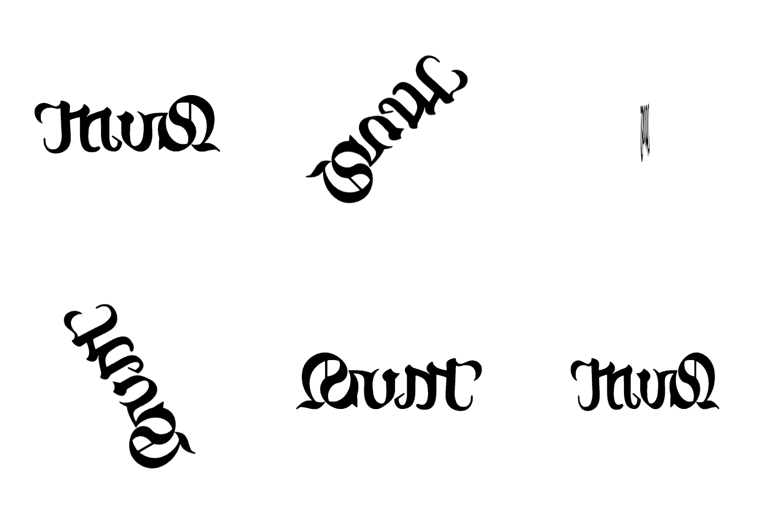
Rotatogram: A typographic design that uses rotation to each glyph separately.
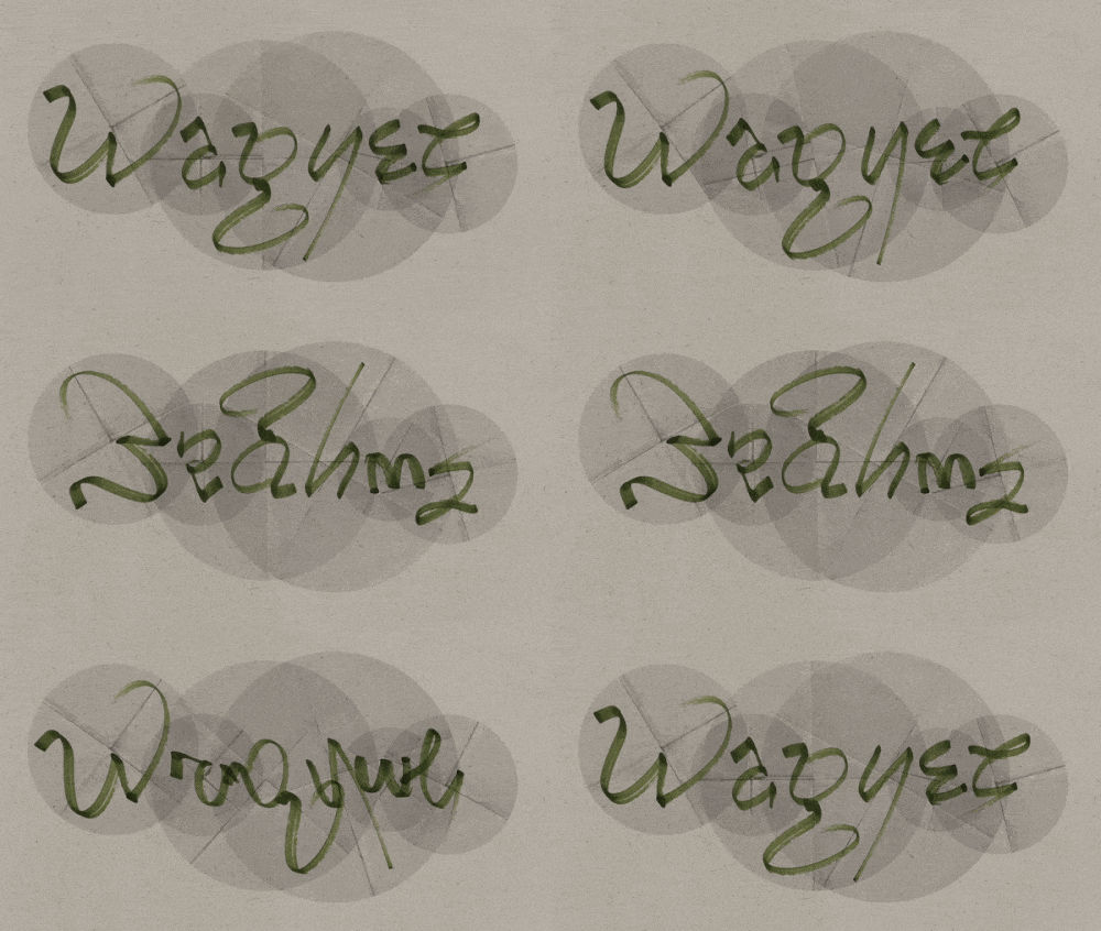
Reflectogram: A typographic design that uses reflection to each glyph separately.
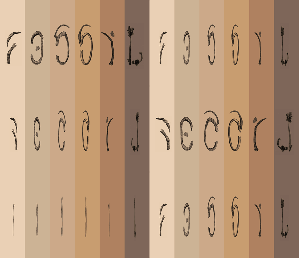
Slidogram: A typographic design that uses translation (movement) to each glyph separately.

Jumblegram: A typographic design that uses multiple geometric transformations in each glyph separately.
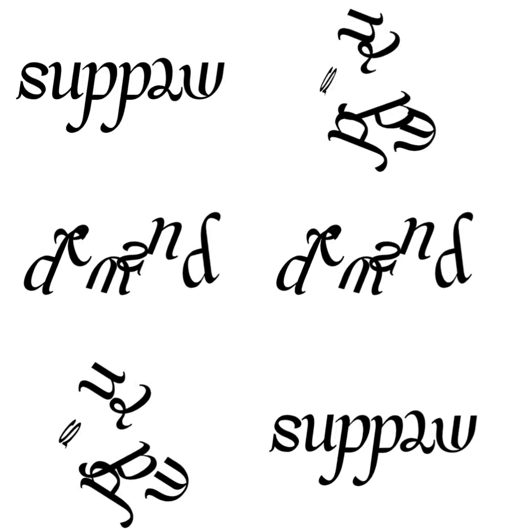
 Mind ambigrams
Middle-form (aka. perceptual shift or oscillation): A typographic design where a letterform can resemble two letters by taking their middle form.

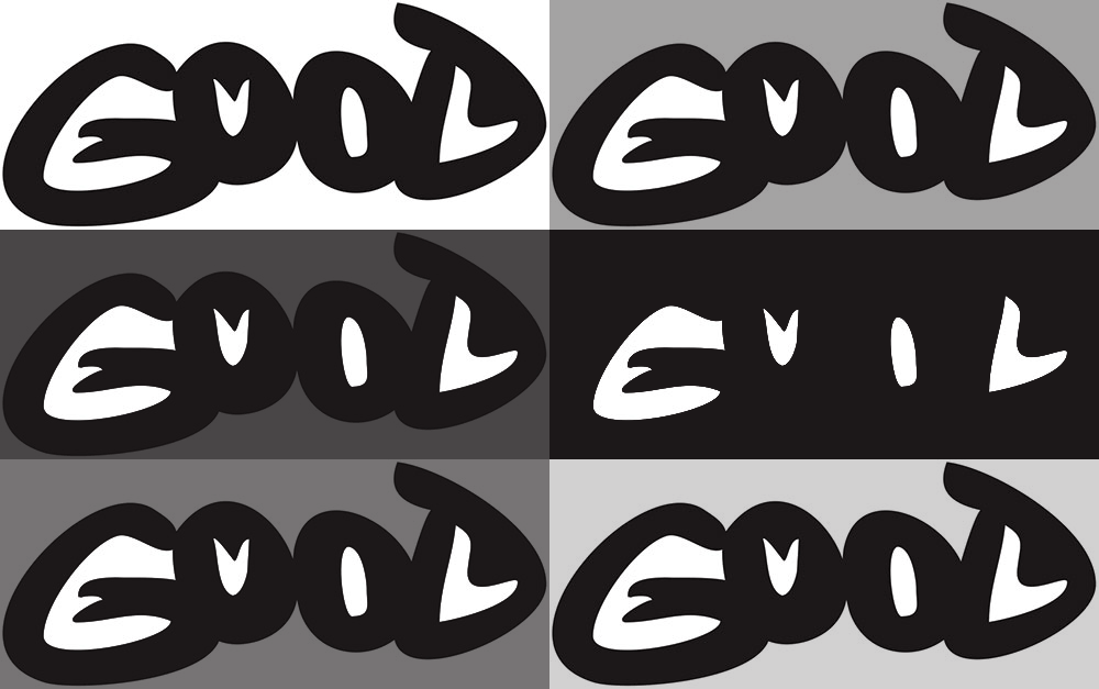
Figure-ground: A typographic design in which both positive and negative space form words.
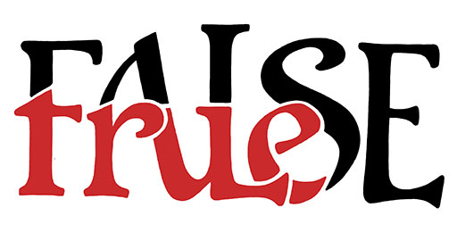
Containment: A typographic design in which a word is contained in a part of another word.
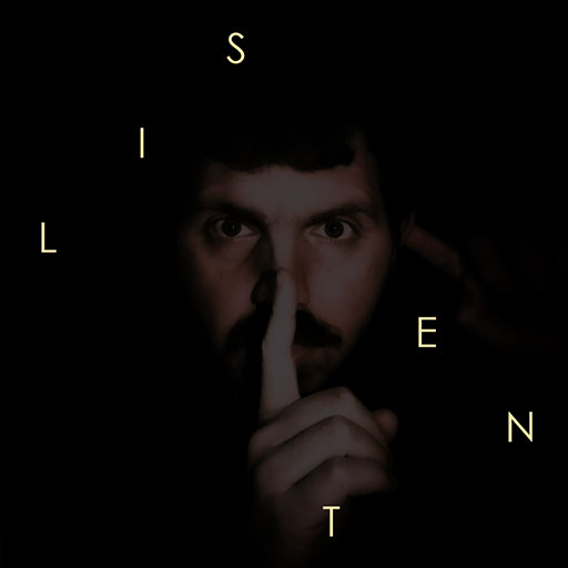
Arrangement: A typographic design in which the letters of a word are displayed in a way that the whole piece can be read in two or more ways.
Fill-the-gap: A typographic design in which parts of the letters are occluded so that the letters can be interpreted in two or more ways.
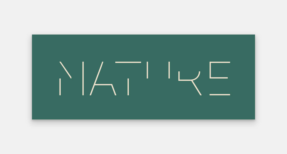
Hidden-cue: A typographic design in which a subtle visual hint, or “cue”, guides the viewer to discover a hidden second reading not immediately apparent.
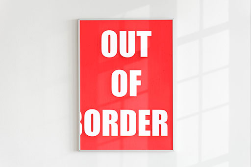
Emphasis: A typographic design where certain letters of a word or phrase are emphasized so that they form a second word.
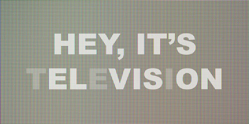
Stableshift: A typographic design where a letterform can resemble two letters by being displayed in an unstable position.
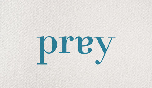
Multistable: A typographic design where a single letterform can be interpreted as multiple distinct letters, depending on the viewer’s perception.
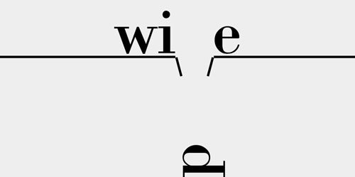
 Filter ambigrams
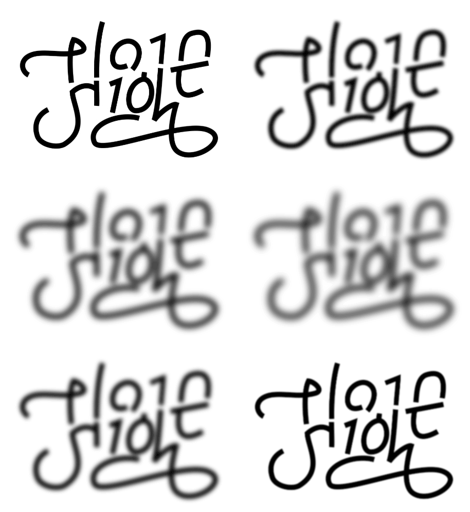
Blur: A typographic design where the second read is visible when viewed through a blurry filter.
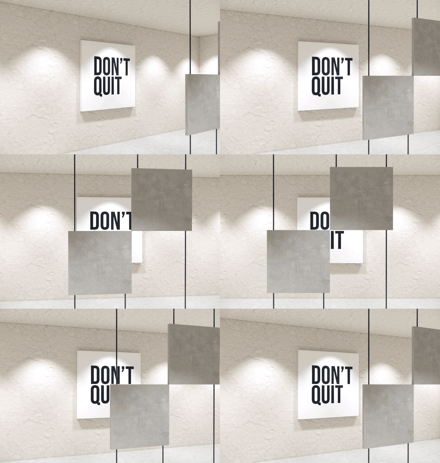
Solid: A typographic design where the second read is visible when a solid object is placed between the viewer and the art.
Last update, February 2nd, 2026.
